Monday 2 February 2015

Evaluation

Q1. In what ways does your media product use, develop or challenge forms and conventions of real media products?


Our chosen genre for the music video task was pop because we felt we know the genre the best and we enjoy listening to it and watching the music videos. Throughout the research stage I learnt many conventions of the pop genre for the videos and digipack/adverts. I found out that the main conventions of pop music videos is that there is always an element of performance, usually by the artist themselves. A typical convention of any music video is that there is narrative and performance, we have used this convention by having the performance mostly in the diner and the narrative of the couple being together in a 'dream' or 'fantasy'. This is also used in Taylor Swift's  'Love Story' where she starts off in a narrative at the school, then into a performance where she sings in the castle, and another narrative/performance in a dream, dancing with her crush. 

Used
In this still shot we see the 'fantasy' narrative. We have used this convention of pop videos by placing the couple close to each other under a tree, the background and lighting suggests a typical dream narrative scene and is similar to the still shot from Taylor Swifts 'Love Story'. The colours used in their costumes are very similar to the trees, almost suggesting they are with the nature, where the only real part of the dream would be the surroundings. This is slightly different to the Taylor Swift still where their costumes are different colours, however they are still very neutral and plain colours, tying in with the theme of the nature and outdoors surroundings. In the Taylor Swift still they are using a medium/close up shot whereas ours is a long shot. I believe the closer shot was more effective at the point trying to be projected so if we had to change this shot it would have to be closer up. You would then be able to see more clearly the closeness and chemistry between the dream couple.


The still here, we used a typical pop convention where the artist is singing
with her dancers in the background slightly, in this case her friends she is telling about the guy she likes. Of course as a pop song we believe it should involve some dancing. We used two 'dancers' that were the same height and opposite to our artist so she would stand out. The artist is also wearing different colours to the other two girls to stand out further. We used a Christmas tree in the central background as it looked pretty but now, in hindsight we should have used a plain background like pink or white to match the fades in and out of the video. This would have looked more professional as our background in this still looks messy. This matches the still we have chosen from Meghan Trainors number one 'All about that Bass'  where she has used a plain background. But still using the same themes we have, two dancers in the background that look different to the artist. They are wearing yellow outfits whilst Meghan wears a contrasting colour, the skin/hair colour and their height could also be used to differentiate between the artist and the background dancers.


Developed
We chose this still shot for developing the conventions of a pop video
because whilst the artist is performing, by lip-syncing, she is not dancing. She is simply singing to her friends, which is often a convention of pop but we have developed this convention further by making it more intense, conversation wise. We also developed this scene as usually in pop performances they can be in still places, either a plain background or a staged set. We have gone to a real diner to make the story line seem more realistic. Because our performance is integrated in with the narrative, at the diner, it made sense to develop this part of the pop genre. We can see in the shot of Bang Bang, by Jessie J, that the artist is performing with dance, with friends around her as well, also dancing. This is different to our performance.


In our video we have included a montage of outtakes and hand held footage. This is sometimes featured in pop music videos because it lightens the mood and this is why we have developed the convention. Often they are just flashbacks or dreams, we have developed this to show the relationship grow over time and the detail of the dream scenario. The reason we have developed this convention is that it is a dream narrative and we wanted to emphasise this and show the good times the artist would have with her dream guy.


This music video 'the one that got away' uses a series of flashbacks to explain the narrative about her boyfriend from when she was younger. I have compared our still to this video as it is a similar narrative in the beginning, however we have developed the use of flashback and montage by putting  it all together near the end whereas Katy Perry has used it throughout. We have also used this technique from a positive view, instead of Katy Perry looking back, getting upset and regretting these event, our artist is happy about the events in her dream narrative.


Challenged
We have challenged the typical convention of the guy being 'hot', muscle-y, tanned, outgoing and have used a guy who is almost socially awkward. You can see in our still shot the artist giving him a kiss, yet he doesn't look entirely happy or even romantic/seductive about it. Throughout our music video you see him awkwardly hugging, holding hands but this is what we have challenged about pop music videos. Usually it is the other way around, the girl being shy whilst the guy is doing everything he can to draw attention towards him and win the girl over. The still shot from 'call me maybe' shows the guy taking his top off. This is typical of a pop video, there is a typical popular guy with tattoos and muscles, this is because it draws in the attention of you females, which is the typical audience of the pop genre. By challenging this convention we hopefully would draw attention to our video and focus on the artist specifically and become well known for doing things differently. This song is different to typical pop songs as she is trying to find a husband rather than a stereotypical hook up. This shows that she is the alpa-female compared to typical pop music videos where the man is in the lead, this also shows to the target audience that the less popular, geeky guys are the ones that girls look for in the long run, this proves that the artist is a good, sensible role model.


Another convention we have challenged (as well as developed) is the performance in the diner. We can see in 'candy man' that the artist is dancing and singing in the diner, even on the bar with a group of dancers surrounding her. In pop music videos we often see a staged dance routine or a lot of general dancing and movement. We have challenged this convention because our video is mostly narrative, and the performance is in a dream/fantasy.


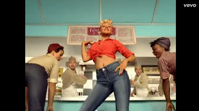
Q2. How effective is the combination of your main product and ancillary texts?


Q3. How did you use media technologies in the construction and research, planning and evaluation stages?


Q4. What have you learned from your audience feedback?


What do you like about the video?


What do you think is happening in our video?


Our genre is pop, how convincing is our video for this genre? Please give reasons.


Any criticisms?


Sunday 1 February 2015

Tuesday 20 January 2015

Advert

This is the advert for our album. We have used The same image and fonts as the digipack cover to keep the consistency and the typical convention of pop album adverts. The aim of an advert is to boost sales of the album and get the artist well known. I believe that this advert will do this but we have set up an online survey to get some audience feedback as the audience perspective is the most important. 

We have put all of the important information you would typically find on a music advert, for example the production company name, artist website and featured/famous songs. Using the pink textured background will attract our target audience-girls aged around 10/12 upwards to possibly early/mid 20's, and encourage them to buy the album. 

Thursday 15 January 2015

DigiPack Front and Back Cover

This is the front and back cover of our digipack we have created so far.

Saturday 20 December 2014

Digipack Cover - Audience Research Results

From my survey monkey I gathered results about our first digipack cover we designed from 8 people. The ages included: one 15-18, five 18-24, one 25-34 and one 55-64, this gave me a good range of ages including our target audience. There was also 7 girls and 1 boy, this was good because our target audience is girls, however it would have been better to get more boys so there was a range of gender as well as age.

Question 3
All of the people who answered the questionnaire said that they liked the fact the font for the artist name and the album name were different, as a result we will keep these current fonts.

Question 4
Half of the answers said yes, the cover does look like a pop album. However half said they were unsure or no. We may change the overall look to this cover slightly to make it look more poppy. Perhaps by using different colours.

Question 5
5 people said it was important for the artist to be photographed on he from of a pop album and 4 people said no. We will keep her photographed as it is the majority and we have found from our other research of digipacks that most pop albums have the artist on the front.

Question 6
Only 3 out of the 8 people said that the digipack would grab their attention in a shop. To change this we may change the text to stand out a bit more, or perhaps changing the colouring of the image so it is a bold album cover.

Question 7
6 people thought that the colours of the text and the image went together. We will keep the colour of the text the same due to this feedback, however we may need to brighten it up.

Question 8
These we're results I got when I asked what we could do to improve the digipack cover.
From this feedback we will be changing the text so that it stands out more, possibly making it bold or a different colour, perhaps changing the layout of it as well. We will also change the image colouring so that the font stands out a bit more.


1st Digipack Cover

This is our 1st draft of  a digipack cover, we have chosen the colour and fonts for the texts and believe that they are effective, however I believe that the colours may need to stand out a bit more, possibly be brighter. They are easy to read and stand out. The image we have used is from one of the scenes used in the music video so it may be familiar to the audience. 


I have created a online survey using SurveyMonkey in order to get some feedback on this album cover. After finding out age and gender questions include:
  • Do you like the fact the artist and album name are different fonts?
  • Does this album cover look like a pop album?
  • Do you think it is important to have the artist photographed in on the front of a pop album?
  • Would this album grab your attention in a shop?
  • Do the colours for the image and text go together?
  • What changes would you make to improve this album cover?
The answers to these could either be Yes or No, or in some cases Unsure, this would give me quick feedback letting me know I need to change something. The last question, however, is an open question. People will be able to tell me what to improve on specifically to help get the perfect digipack cover.


Friday 19 December 2014

Music Video


This is our Final Music video.

Beyonce-Album Advert

This advert is a bit different to the others I have looked at. It still has the front digipack cover on there, but very small and it doesn't grab your attention straight away. This advert uses two of the inlay images, both of which the artist is in very similar poses. one with, and one without makeup. This is showing the transition between the two different looks of one person, bringing out the famous alter-ego.
The colours throughout the advert are constant, with a sepia filter. Although Beyonce isn't fully in the pop genre, it is unusual for pop adverts to have one tone. They are normally more colourful to grab the audiences attention. However this could draw the viewer in as it is different to others and does actually stand out.
The font throughout the large type is the same, with the Sasha Fierce logo which is very well known. Again, drawing in the audience. On the side we see a smaller group of very simple, plain text, this is mentioning the famous songs on the album, also drawing in the audience and advertises the album successfully.

Jessie J-Album Advert

This is Jessie J's advert for her album 'Who you Are'. Is has the same image and logo as the album itself, which is a typical convention for pop adverts. Especially as their album covers get very well known. 
It has an extension on the bottom, however, different to Lana Del Rey it is not an extension of the image. It is plain black, tying in with the colour theme on the artists hair, nails, make up and clothing. This works well as the block colour stands out and the text is therefore enhanced and the audience is drawn into it to read. 
The text is a simple font, easy to read and is using the same colours as the text in the album cover, this creates a sense of consistency and continuity, and advertises her album and songs well.
Once again, the 'legal jargon' is placed at the bottom of the advert, with the logos of the record label.

Tuesday 16 December 2014

Lana Del Rey-Album Advert


Although Lana Del Rey is not our exact chosen genre I decided to look at the advert for her album as it is the same as her album cover, but just extended. This is effective because the target audience are most likely to know what the album cover looks like, especially with this one as it is so simple.
There is the same font used for the artist name and the album name, this is going against our conventions for pop digi packs. However the font for the information about the release date and the songs is different and stands out for this reason.
At the bottom of the advert we see the logos of where the album is sold, the artist website and the music label.
The colour of the font and background have swapped for each part of the types-white on blue and blue on white. I like this idea, it makes each stand out separately without changing fonts.

Friday 12 December 2014

Editing Day

Today we had the day off time table in order to get the majority of our music video edited. As we started editing as we went along anyway, we took the opportunity to film some last minute shots as well. Having the long time to do this in one session was very helpful, especially as we were surrounded by people who could help us and share ideas.

Tuesday 2 December 2014

Filming Update

On December 1st we went back to Deans Diner to film our performance side of the music video. We took shots of the same thing from different angles and ensured that we had more than enough footage in order to fill the whole song. Whilst we were in Braintree we went over to Freeport outlet centre and filmed some of the narrative part as the 'future husband' treats the artist 'like a lady' buying her clothes and presents. 


Whilst filming we realised that we couldn't change the lighting as the Diner was open but there was quite a lot of natural light coming through the front windows. We decided that, to get round this problem that we would use a colour corrector of Final Cut Express when editing in order to get the right look for our pop music video.

Sunday 30 November 2014

Editing Update

We have started to edit as we go along whilst filming. As we were filming the early parts of the video, and editing them, we have realised that our Treatment may not be realistic and may have to make a lot of changes to the way we film and the order of the video sequence. We have changed this by filming extra footage to what we need so that we can fill any gaps easily in our video, but still keeping in the theme and story line of the video, and not going off on a tangent and confusing the audience.

Saturday 29 November 2014

Decisions-Fonts


Following our audience research we decided to go for the  first font for the artist name as most of the girls who were in our target audience liked it and though it would be the best choice. As the 15 year old's said to use pink we have used this font and test out different colours, including baby and hot pinks, as also seen in a previous post.

And for the album title we have decided to also use the first font as we believe it was the most appropriate as it looked classy an good for a pop digipack cover - according to our research. We have not yet decided on colours for this text but I think it needs to be different to the colour of the artist text. As the boy in our audience research said it would look good with a constant font because it would look neater, we have decided that it is a possibility to use the same font for the album title and the song titles on the back cover, so there is a consistent theme throughout the digipack but with the artist name standing out.

Friday 28 November 2014

Fonts-Audience Feedback


I showed this image to and audience including two 18 year old girls, one 17 year old boy, three 15 year old girls and a woman in her 40's.

The 18 year old girls said that it was a good idea to have the different fonts for the artist name and the album name. They liked the 1st and the 3rd font for Rosie Pink as they were 'edgy' and 'classy', respectively. For the album name they liked the fact that it was 'movie/hollywood themed' as it fits with the song. They like the 2nd font as it was different to others they have seen on album covers. The girls disliked the last font for Out All Night as it looked 'like highschool sport' writing and 'unprofessional'

The boy thought the 2nd font was best for the artist name as it was 'girly and perfect for a pop album' he said it was also easy to read which is important for a digipack cover. He also said that having a handwritten font was a good idea, and it was as if she ha signed it herself. This boy said that it would be better to have the same font for both of the artist and album name as it would look neater, however if he had to choose one he would choose the first one as it is 'easy to read' and reminds him of the 'entertainment industry'.

The three girls all agreed that the 1st font was best for the artist name as it 'looks like a signature', is 'unique' and it is 'perfect for a pop CD'. They gave me some ideas on colours as well. They all said that the artist name should be pink as it is a 'girly and poppy colour', but two of them said to use a baby pink and one said to use a hot, bright pink. Two of the girls really like the first font of Out All Night as it looked 'classy' and 'like a proper album title'. The third girl liked the second font as it looked more like the theme and genre we were going for. None of the girls liked the third font as it reminded them of high school musical and looked 'childish'. But they all thought that is was good to have different fonts for the two texts as I differentiates the two products - the artist and her ego and the album.

Finally the woman said that she liked the 3rd font for Rosie Pink as it was 'feminine and classy' and 'still in keeping with the pop genre'. For the album title the font she liked the most was the first as it was 'easy to read', 'stands out' and 'looks like a professional title'.


Possible Fonts

Today we started looking at different fonts and styles for our digipack. From the theme of the song of 50's style, film style we decided to look at vintage film posters to get a feel for the style and fonts used. This gave us a lot of inspiration as to what font we wanted for our album title.

We decided to have a different font for the album name and the artist name as this is a common theme throughout pop digipacks.

Our chosen artist name is: Rosie Pink, and the chosen album name is: Out All Night. For the artist name we want a handwritten font, so it looks like the artist has signed it herself. For the album title we believe a bolder, capital font would be better to really make the name stand out. This is also a theme throughout the vintage film posters-bold writing, usually on a slant. 

We had a look into different colours to use and as it is a pop album we believe bright, girly colours should be used to stand out and really emphasise the artists image. These are the different colours we have tested so far, with a range of pinks, from light and dusky to bright and deep. Personally I think we should use a pink more like the top right colour as it is very girly and a happy colour. Perhaps layering it over a deeper colour would make it stand out and make a statement.

Thursday 27 November 2014

Album Title

Many pop albums are named after songs on the album or something to do with the artists life. As our artist is quite young we thought we should go for something fun to do with her life. With the help of the teacher we came up with 'Out all Night'. I like this name for an album because it suggests the artist wants to just have fun and live her life whilst she's still young.

Artist Name

We have decided on an artist name. I believe it should be a short, quick and memorable name like Rihanna, Beyonce, Madonna for example. From a few suggestions we had Rosie was our favourite as is stood out most for us and is quite a classic name, which would tie in with the whole theme and image of the artist.

We still believed it was missing something so thought of adding a surname, like a colour to make it still memorable. Our first choice was Rosie Black so the black is contracting and still sharp and to the point. We went through many different names and variations and finally came up with the chosen name 'Rosie Pink' roses are obviously red/pink so this seemed like and obvious choice for us to go with. I like is as it sounds like quite a fun, but innocent name that would be memorable and stand out in the world of pop.

Wednesday 26 November 2014

Filming Update

As we are coming up to christmas the diner is starting to get busy. We wanted to film again this friday, the 28th november however we was not able to secure permission for that day in Deans Diner. However they have given us permission to film in the diner on monday 1st december, this is where we will get all of the performance filmed. We will also film some of the narrative scenes in the surrounding designer outlet centre. 

Saturday 15 November 2014

Prop List 1

These are the props we used in our first set of filming for the narrative side of our video:

  • Burnt Apple pie
  • Fresh boxed apple pie
  • Shopping bags filled with food
  • Candles
  • Single rose
  • iPad and stand
  • Oven mitten
The apple pies/recipe on iPad/grocery bags are used in the video as synaesthesia. The artist sings about each of these items and at this point in the song we will see each of them. This is quite typical of music video but it is especially a convention of pop music videos.


Thursday 13 November 2014

Analysis of Pop Digipacks-Britney Spears

As a group, Bronwyn and I ad analysed the digipack of Britney Spears' 'In the Zone' album. We thought it was good to a get a digipack in real life to analyse as we could see the whole book and look closely at the detail. 

We believed Britney would be a very good example for us to use as she is a huge 'pop princess'. This is her 4th studio album so it is a bit later than the innocent school girl image she was trying to project. The pictures in this digipack are much more sexualised and grown up, as she is trying to enhance her celebrity image on another level at this point in time.

The video of our analysis is on our Wix website: http://nfgsyasminknott.wix.com/yaswynproductions#!videos/cww2

Shot List for Music Video

We have started to created a shot list for the performance part of the video, including every single shot and angle we will see in the music video. This is because when we come to film and edit the video we will know exactly what we're doing and will make it a lot easier to get right. We have done it in pencil, just in case we decide to make any changes, for example in the diner there may be customers sitting where we want to film. 


Tuesday 11 November 2014

Analysis of Pop Digipacks-Katy Perry

Katy Perry
Teenage Dream
This digipack, I believe, is very typical of a pop digipack. You can tell by the colours and photos of the artist. The digipack is projecting the artists image and this is the main aim for a pop artist.

Image: The image of the artist is quite sexual, we see her naked, laying down in a provocative position. The clouds she is laying on are supposedly made out of cotton candy, sweet things are sometimes portrayed as amorous therefore adding to the sexual image of the artist. Her mouth is slightly parted, adding to the sexual connotations, however this suggests that the album is still about the music and the fact she is a good singer.

Colour: The colours in this digipack are all very similar. Pinks and reds are used, this is also quite typical of a pop digipack and the colours are portrayed as very girly. The blue at the top on the image suggests its at an actual location and makes it a bit more realistic rather than a photo shoot in a studio.


Text: The artists name stands out the most, the font is curly-also a very girly convention, it looks like it has been blown up, perhaps with bubbles or a balloon. This could also be thought of as a provocative image. The album name is made out of sweets, this a theme in the album as you can see that there are sweets used for the 'o's on the back of the album. The sweets give the album a very poppy and girly feel which makes the artist successful in want she wants to portray at this point in time. The album name also looks like it is melting, this could suggest that her 'Teenage Dream', like most, could be slipping away. 


Filming Prep-Male Gaze

To challenge the convention of the male gaze, as our target audience is predominantly younger females, we plan to film the woman in the view of other women.

Laura Mulvey came up with the idea of the 'Male Gaze' in 1975. It's the idea about how the audience views the characters from the male heterosexual perspective. And this convention will be challenged by us in our pop music video. We will do this by focusing on her voice rather that her image and body features.


Monday 10 November 2014

Production Meeting-Timetables, Planning of Filming

We have just had a production meeting comparing timetables. We have found a new actor that has a similar timetables to us. We will start filming on Friday 14th November periods 2,3,4 and during lunch, Bronwyn has permission to leave her RE lesson and we will be filming during our double Media Studies lesson.

Saturday 8 November 2014

Issues with Production

As we have come to the time to start filming we have realised it may be a problem getting everyone together at the same time, with the actors we chose originally. This has delayed our filming drastically. We may need to change our male actor as he is currently very busy, this means we may have to make some slight changes to the music video.

Wednesday 5 November 2014

Prop-Engagement Ring

For one of our props we will use, we have got an engagement ring for the husband to propose to the artist at the end of the video. This ring is obviously an engagement ring as it have a big diamond in the middle with smaller diamonds around the band of the ring.