Showing posts with label Plannning. Show all posts

Saturday, 20 December 2014

Digipack Cover - Audience Research Results

From my survey monkey I gathered results about our first digipack cover we designed from 8 people. The ages included: one 15-18, five 18-24, one 25-34 and one 55-64, this gave me a good range of ages including our target audience. There was also 7 girls and 1 boy, this was good because our target audience is girls, however it would have been better to get more boys so there was a range of gender as well as age.

Question 3
All of the people who answered the questionnaire said that they liked the fact the font for the artist name and the album name were different, as a result we will keep these current fonts.

Question 4
Half of the answers said yes, the cover does look like a pop album. However half said they were unsure or no. We may change the overall look to this cover slightly to make it look more poppy. Perhaps by using different colours.

Question 5
5 people said it was important for the artist to be photographed on he from of a pop album and 4 people said no. We will keep her photographed as it is the majority and we have found from our other research of digipacks that most pop albums have the artist on the front.

Question 6
Only 3 out of the 8 people said that the digipack would grab their attention in a shop. To change this we may change the text to stand out a bit more, or perhaps changing the colouring of the image so it is a bold album cover.

Question 7
6 people thought that the colours of the text and the image went together. We will keep the colour of the text the same due to this feedback, however we may need to brighten it up.

Question 8
These we're results I got when I asked what we could do to improve the digipack cover.
From this feedback we will be changing the text so that it stands out more, possibly making it bold or a different colour, perhaps changing the layout of it as well. We will also change the image colouring so that the font stands out a bit more.


1st Digipack Cover

This is our 1st draft of  a digipack cover, we have chosen the colour and fonts for the texts and believe that they are effective, however I believe that the colours may need to stand out a bit more, possibly be brighter. They are easy to read and stand out. The image we have used is from one of the scenes used in the music video so it may be familiar to the audience. 


I have created a online survey using SurveyMonkey in order to get some feedback on this album cover. After finding out age and gender questions include:
  • Do you like the fact the artist and album name are different fonts?
  • Does this album cover look like a pop album?
  • Do you think it is important to have the artist photographed in on the front of a pop album?
  • Would this album grab your attention in a shop?
  • Do the colours for the image and text go together?
  • What changes would you make to improve this album cover?
The answers to these could either be Yes or No, or in some cases Unsure, this would give me quick feedback letting me know I need to change something. The last question, however, is an open question. People will be able to tell me what to improve on specifically to help get the perfect digipack cover.


Sunday, 30 November 2014

Editing Update

We have started to edit as we go along whilst filming. As we were filming the early parts of the video, and editing them, we have realised that our Treatment may not be realistic and may have to make a lot of changes to the way we film and the order of the video sequence. We have changed this by filming extra footage to what we need so that we can fill any gaps easily in our video, but still keeping in the theme and story line of the video, and not going off on a tangent and confusing the audience.

Saturday, 29 November 2014

Decisions-Fonts


Following our audience research we decided to go for the  first font for the artist name as most of the girls who were in our target audience liked it and though it would be the best choice. As the 15 year old's said to use pink we have used this font and test out different colours, including baby and hot pinks, as also seen in a previous post.

And for the album title we have decided to also use the first font as we believe it was the most appropriate as it looked classy an good for a pop digipack cover - according to our research. We have not yet decided on colours for this text but I think it needs to be different to the colour of the artist text. As the boy in our audience research said it would look good with a constant font because it would look neater, we have decided that it is a possibility to use the same font for the album title and the song titles on the back cover, so there is a consistent theme throughout the digipack but with the artist name standing out.

Friday, 28 November 2014

Fonts-Audience Feedback


I showed this image to and audience including two 18 year old girls, one 17 year old boy, three 15 year old girls and a woman in her 40's.

The 18 year old girls said that it was a good idea to have the different fonts for the artist name and the album name. They liked the 1st and the 3rd font for Rosie Pink as they were 'edgy' and 'classy', respectively. For the album name they liked the fact that it was 'movie/hollywood themed' as it fits with the song. They like the 2nd font as it was different to others they have seen on album covers. The girls disliked the last font for Out All Night as it looked 'like highschool sport' writing and 'unprofessional'

The boy thought the 2nd font was best for the artist name as it was 'girly and perfect for a pop album' he said it was also easy to read which is important for a digipack cover. He also said that having a handwritten font was a good idea, and it was as if she ha signed it herself. This boy said that it would be better to have the same font for both of the artist and album name as it would look neater, however if he had to choose one he would choose the first one as it is 'easy to read' and reminds him of the 'entertainment industry'.

The three girls all agreed that the 1st font was best for the artist name as it 'looks like a signature', is 'unique' and it is 'perfect for a pop CD'. They gave me some ideas on colours as well. They all said that the artist name should be pink as it is a 'girly and poppy colour', but two of them said to use a baby pink and one said to use a hot, bright pink. Two of the girls really like the first font of Out All Night as it looked 'classy' and 'like a proper album title'. The third girl liked the second font as it looked more like the theme and genre we were going for. None of the girls liked the third font as it reminded them of high school musical and looked 'childish'. But they all thought that is was good to have different fonts for the two texts as I differentiates the two products - the artist and her ego and the album.

Finally the woman said that she liked the 3rd font for Rosie Pink as it was 'feminine and classy' and 'still in keeping with the pop genre'. For the album title the font she liked the most was the first as it was 'easy to read', 'stands out' and 'looks like a professional title'.


Possible Fonts

Today we started looking at different fonts and styles for our digipack. From the theme of the song of 50's style, film style we decided to look at vintage film posters to get a feel for the style and fonts used. This gave us a lot of inspiration as to what font we wanted for our album title.

We decided to have a different font for the album name and the artist name as this is a common theme throughout pop digipacks.

Our chosen artist name is: Rosie Pink, and the chosen album name is: Out All Night. For the artist name we want a handwritten font, so it looks like the artist has signed it herself. For the album title we believe a bolder, capital font would be better to really make the name stand out. This is also a theme throughout the vintage film posters-bold writing, usually on a slant. 

We had a look into different colours to use and as it is a pop album we believe bright, girly colours should be used to stand out and really emphasise the artists image. These are the different colours we have tested so far, with a range of pinks, from light and dusky to bright and deep. Personally I think we should use a pink more like the top right colour as it is very girly and a happy colour. Perhaps layering it over a deeper colour would make it stand out and make a statement.

Wednesday, 26 November 2014

Filming Update

As we are coming up to christmas the diner is starting to get busy. We wanted to film again this friday, the 28th november however we was not able to secure permission for that day in Deans Diner. However they have given us permission to film in the diner on monday 1st december, this is where we will get all of the performance filmed. We will also film some of the narrative scenes in the surrounding designer outlet centre. 

Thursday, 13 November 2014

Shot List for Music Video

We have started to created a shot list for the performance part of the video, including every single shot and angle we will see in the music video. This is because when we come to film and edit the video we will know exactly what we're doing and will make it a lot easier to get right. We have done it in pencil, just in case we decide to make any changes, for example in the diner there may be customers sitting where we want to film. 


Tuesday, 11 November 2014

Filming Prep-Male Gaze

To challenge the convention of the male gaze, as our target audience is predominantly younger females, we plan to film the woman in the view of other women.

Laura Mulvey came up with the idea of the 'Male Gaze' in 1975. It's the idea about how the audience views the characters from the male heterosexual perspective. And this convention will be challenged by us in our pop music video. We will do this by focusing on her voice rather that her image and body features.


Monday, 10 November 2014

Production Meeting-Timetables, Planning of Filming

We have just had a production meeting comparing timetables. We have found a new actor that has a similar timetables to us. We will start filming on Friday 14th November periods 2,3,4 and during lunch, Bronwyn has permission to leave her RE lesson and we will be filming during our double Media Studies lesson.

Saturday, 8 November 2014

Issues with Production

As we have come to the time to start filming we have realised it may be a problem getting everyone together at the same time, with the actors we chose originally. This has delayed our filming drastically. We may need to change our male actor as he is currently very busy, this means we may have to make some slight changes to the music video.

Wednesday, 5 November 2014

Prop-Engagement Ring

For one of our props we will use, we have got an engagement ring for the husband to propose to the artist at the end of the video. This ring is obviously an engagement ring as it have a big diamond in the middle with smaller diamonds around the band of the ring.


Monday, 27 October 2014

Storyboard

This is our storyboard for the music video. We have only done a storyboard for the the narrative as it would be too hard to draw a storyboard for the performance side of the video because we ideally want many different shots to cut at the same rate as the song.
We decided to use a whiteboard as we could change things easily as we go along if needed. We did this because while we knew who we wanted in the scene we wanted to think about the different ways we could shoot them to give a subtext to the video. For example, perhaps we would want to focus on the costume of the husband and focus in on the ring box at the end. To help us with the filming we have also put the timings so we should be able to get it exact.
00.25-00.46
00.46-00.56

00.58-01.08
01.10-01.20


01.23-01.34
01.34-01.44

02.11-02.23

02.47-02.57

02.58-3.03


Thursday, 23 October 2014

Locations

Whilst creating our treatment and storyboard we have been discussing our locations for the music video. We have two main locations: Dean's Diner (mostly performance) and Hannah's (our artist) kitchen (mostly narrative).

Our other locations include a fireworks display, autumn pathway with surrounding trees, train platform and a restaurant. (Photos to follow)

Camera Angles and Shots

I looked as Psycho's famous shower scene for the camera work as it is filmed in a very unique way.

This scene is filmed with one continuous shot, but to get the continuity perfect there is approximately 6 cameras used. As we will be having many different camera angles in such a short time it may be hard to get the continuity correct, we may need to use more than one camera to film the different angles of the music video.

After the superimpose form the plughole to the eye, we see the camera move in an unexpected way. As the camera tracks out we expect it to come upwards to the left side of the bathroom but it actually tracks out towards the door way and into the bedroom. We may use a technique like this when the man in a suit is in the shot, this will vary the number and type of shots we use in the music video. We took a test shot on our actor with the suit on to see how it looked and whether it will work.

Costume Idea


For our male character we will have him dressed in a suit for most of the video as he is a 'classy guy' who works so this would fit in well with the lyrics. This is our male actor dressed in an outfit similar to what we imagine to be in our music video.


The artist will be wearing a 50's inspired outfit for the performance, mostly set in the diner as this fits with the location and mis-en-scene, as well as the song as it has a 50's feel to it. This is an example of what we will dress the artist in.


For the narrative, the costume will be less dressy and more modern, but still with a slight 50's theme. 


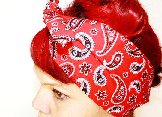
Red was a popular colour wit 50's outfits so we will include things like a red tie and red bandanna, so the couple in the video are matching.

Wednesday, 15 October 2014

1st Draft Treatment for 'Dear Future Husband' Music Video

All the narrative will be a dream or fantasy in the artists view.

Before the song starts (approx. 4 secs) we will have diegetic sound in the diner. The artist (main character) will put money into the jukebox and selecting a song to play, this will start in black and white filter. As the first stanza of the song is being played as diegetic sound the artist will go back to the table with her girlfriends as part of the narrative. This will be up to 19 seconds into the song. From 19-22 secs we will have a mid shot of about 3 men harmonising the 'aahhhhh' just before the song kicks in, we will fade the filter into enhanced colour, this is a performance part of the video.


In the diner as the song starts the first lyrics are 'Take me on a date' so we will have the artist watching the 'future husband' come through the entrance of the diner as she sits in a booth with her friends, it will be filmed in the mirror with both the artist and husband in the shot. This will be from 22-25 secs. 

The next shot will be an over the shoulder shot of the husband at the front door holding a bunch of flowers. This shot is from 25-30 secs it will show the door opening, the husband coming through the door and the hallway. This is also a narrative part of the video. At 30-34 secs we will then see the artist singing 'I'll be the perfect wife' in the kitchen with 'world's best wife' apron on. In the background there will be vintage shopping bags with groceries in, we will do a sweeping shot round to focus on their relationship and the shopping bags.


At 34 secs we will have a second long shot of peoples feet at a train station - commuting to work. This will be a real-life narrative. Then, we will cut to the artist at work in an office, she will comically playing a game on the computer or her phone, whilst we see her sing 'but, baby, so do I'. This will be a performance shot until 38 secs. 

From 38-43 secs we'll cut to the artist in the kitchen with a recipe book out with apple pie recipe page, flour and other cooking ingredients out on the surface. She will then get a burnt apple pie out of the oven, and then a ready made one out of the fridge on the line 'but i can find a hook'.
At the line 'sing along with me' we see the artist singing to the camera, this is at 43-46 secs. 


From 46-56 secs we will see the narrative involving them shopping in a clothes store and the 'husband' will hold up an expensive dress to her front, this will be a side/over shoulder shot, we see the artist sing 'treat me like a lady'. They will also be messing around.

From 58 secs-1.08 mins we will see the performance side of her singing in the diner to her girlfriends sitting down opposite her.

At 1.10-1.20 mins we will show the narrative of the artist with the 'future husband' of them walking through the town/streets at night time.


After we see them walking through the streets we will see the artist crying from a fight they've had, we will see the 'husband' then say sorry to the artist then hug her and kiss her head. This scene will be from 1.23-1.28 mins.

When she sings casually 'you know i'm never wrong' we will see an over the shoulder shot from the husbands point of view of her singing it to him as part of the narrative 1.28-1.30 mins.

At 1.30-1.34 mins we will see the artist singing directly to the camera as if the artist is getting sympathy with the audience, (who will mostly be girls).


Our next scene will be at a fireworks display. We will include a lot of handheld camera shots and amateur filming to create the effect that they're together and he's treating her well. We will have shots that include them standing together, fireworks in the background etc. This will be from 1.34-1.44 mins.


At 1.47 mins there is a key change. We will have further performance-the artist and her friends will be dancing. We will also see the artists lip syncing to the chorus-the 'live singing' part we can hear in the background.

This will be continued till 1.59mins, then it will go back to the narrative side till 2.08 mins, where we will see the artist being surrounded by the future husband's family in a home environment. 


2.11-2.23mins The artist will be in bed on her own (left side) and we see her go to sleep and into a dream. In the dream narrative they go to a posh restaurant and he opens the door for her, in a suit, as she walks through the door he gives her a kiss. We have a shot of the husband in a suit an pan down to see him get a ring box out of his pocket.

At 2.23 -2.32 mins The narrative side of the story will insist montages of the previous shots that included both artist and the future husband, this will be outtakes style.

2.35-2.44mins The artist will be performing to the camera, using a close up shot. This then applies to Goodwin's theory with the close up shot of the lip syncing and visuals amplifying the lyrics. We will also be using flashbacks of the previous shots and scenes we have used in the video.

2.47-2.57mins We will see the narrative side of the artist putting her arms round the future husband's neck, pan round with a long shot of him pinching her bottom. On the line "Tell me I'm beautiful", we will once again get a close up shot this time of the husband lip syncing 'You're beautiful' to her.
2.58-3.02mins towards to the end, we see him preparing to propose as part of the dream narrative. We will then after the music stops, we will change to diegetic/no sound as he goes down on one knee to propose and holding the open box with a ring. 

Tuesday, 14 October 2014

Production Meeting 2-Lyrics and Video Planning

We have printed off the lyrics to Dear Future Husband and started annotating them to get a basic idea of where to start with our music video planning. With this we are thinking of locations, different types of shots, colour filters, costume, characters, props etc. as these are very important components of a music video.

The first idea we had was taken from our audience research and that is to start the video in black and white and transform into colour from 18 seconds into the song. Another set idea we have had is to start the video before the song and include the first 18 seconds as diegetic sound in the diner.

We believe by annotating these lyrics will make our ideas come through quicker and when writing our treatment it will flow nicely. 

Taylor Swift-Love Story


I am choosing to look at this music video as it has a range of narrative story lines-3; the college, the ball and in the castle. These are three very distinct narratives with the performance being in the castle where we see her in her fantasy, singing about the fantasy. This works well with the lyrics of the song as it is a very fantastical song. She dreams about being with a 'Romeo' who is just a made up character. It could be said that this convention is broken at the end with the suggestion that they are together in the end in real life, in the college narrative story.

Our production will be very similar with the form of the video. We plan to have a 'real life' performance/narrative with her singing about him (in the diner location) and wanting to be with the 'future husband', a narrative story where she's trying to be with him and also another 'dream' narrative were she actually is with him and they are together.

Monday, 6 October 2014

Production Meeting 1

Today we had a production meeting to discuss our chosen song and any ideas we have had. We found this very useful as we get our first, initial ideas about our song choice so they can grow from there.

We made brief notes of what we discussed to get  starting point to planning the content of our video as well as some audience research.