Media Studies Blog for Music Video task by A2 Level Student. Group website: http://nfgsyasminknott.wix.com/yaswynproductions Group Twitter: @YasWyn Group SoundCloud: YasWyn Productions
Monday, 30 June 2014
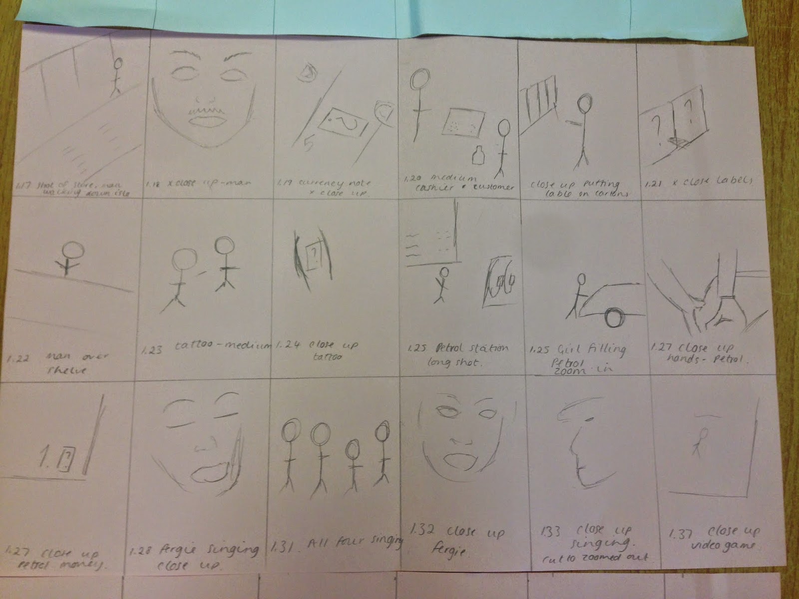
Preliminary Task Idea 1-Storyboard
I created the storyboard to help us visualise the music video and to help us to film and edit the right parts for the film and edit it in the correct order. There is 52 shots in the minute of the video we are recreating. This task will be good for us to experiment with the different shots and the volume of shots we will be working with.
Preliminary Task Idea 1-Shotlist
We created a shot list for each scene in the minute of the music video we are creating, this would help us to plan the filming and editing stages easier and actually to make recreating the video easier. There is almost a shot per second so it is going to be a challenge for us but it will be very interesting to make.
Preliminary Task Idea 1-Aim
This is our initial idea for the preliminary task, we will be recreating 1 minute of the music video of Black Eyed Peas-Where Is The Love. We chose this video because it has a variety of shots, almost one different shot per second, with different characters and we will be able to present our filming and editing skills through this. Throughout the video there is constant themes, including the red question mark on stamps and flyers etc. we thought this is important to the video and thought it was interesting and unique to recreate. Most of the video is filmed in urban areas, which would be different to what we created previously, and would create a challenge for us to film in.
The single is from the Black Eyed Peas third album 'Elephunk' and was released on June 16th 2003. It reached number 8 on the Billboard 100 and was number 1 in the UK and Australia.
Album Cover Analysis-Lil Wayne
Lil Wayne-Tha Carter III
This album cover is very interesting. The image shows a child version of Lil Wayne, the fact that it is a child suggests the innocence of the artist/album and intrigues the audience. The child has tattoos which is illegal and therefore shows there is an element of danger to this album, as it is very unusual the audience is also drawn to the album cover from this as well. The tattoos also show maturity and adult themes within the album. We know that this is a squeal album as it is number three, this suggests to us that the artist has been successful with his previous albums and hints that it will again be a good album, likely to be successful.
The fact that the album is a squeal is shown in a different way with the use of Roman numerals, this also adds a classic, old-fashioned theme to the album. The red and white on black background stand out a lot however it is not the first thing the audience is drawn to with this album. The red text could suggest danger, keeping in theme with the stereotypical view of tattoos as dangerous.
The back cover has the same colour theme of red and white on black but the font for the title changes, this could disturb the audience as it is quite unusual. The image on the back is $100 dollar bills, suggesting to us that the artist is rich or his songs are about money, this could also emphasise the fact that he is successful as this is his third album in this sequence.
Album Cover Analysis-Pharrell Williams
In the images we can see Pharrell with three girls in the picture. We can tell he is the dominant person in the picture as he is standing out of line to the others and he is the tallest and we can see the most of him out of all the people in the shot. The fact that he is the only male, black person in the shot also shows that he is dominant, this could mean he has a lot of power and perhaps holds it over these girls. The red head girl may also be considered as dominant as she is the front of the shot and on the back of the album she is the only person with her eyes in view, whilst Pharrells are covered with his iconic hat and the other girls are wearing. The image may also suggest that he is a bit of a 'ladies man' as he is the only male and the album is called GIRL, and is about the most important women in his life.
On the front cover, everyone is wearing sunglasses, hiding their eyes. This hides their emotion and could also be hiding away a secret or something the audience is not supposed to know but want to find out, this would attract the audience to the album.
The title of the album is written in bold capital letters, this shows that the artist really wants to get a message out with this album, as it is about the most important women in his life. The colour yellow is used, this symbolises intelligence, energy, happiness and creativity. One of the songs on the album is called happy so this colour represents the content of this album. The title is repeated again on the back cover in the same way, emphasising further what this title means. The other text is around the picture of the people, emphasising their presence in the album, ensuring they get all the attention and the names of the songs are not as prominent, making the audience want to listen to the album.
Album Cover Analysis-Coldplay
Coldplay-Ghost Stories
The front cover is fairly simple, with a blue, midnight sky in the background with a pair of angel wings in the front. Within the wings there are many small images that mean and represent different things about the songs on the album, this could suggest that a lot of thought went into creating the album cover with meaning and it is very important to the band to get it right. It also sends out a message about the album as a whole, that there is a background story to each song, also suggested by the name of the album 'Ghost Stories'.
The colours are simple. White on a dark, navy blue, this emphasises the impact of the wings over the sea and night sky. The use of just 2 simple colours also has an impact to feel of the album. These colours look mysterious but also create a feeling of melancholy to it as they are fairly plain and dull.
The lack of text on the front cover makes the album stand out, it makes you think what it is and what it's representing. This would make you pick up the album in a shop to find out more about it. The text on the back is very plain and simple, again making this album stand out and intrigue the audience. On the whole album you can't see the name of the band, but they are so well known it is expected of the audience to know what album it is and who it's by. This adds to the mystery and secrecy of the album.
Friday, 27 June 2014
Introduction
For my A2 media studies coursework I will be creating a promotional package for the release of an album including a music video as the final product. This project will also include creating a cover for the CD as part of the digipak and a magazine advertisement.
Subscribe to:
Posts (Atom)